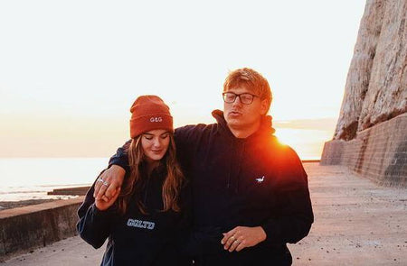
G&G Designer, Roy, has been designing for Goose and Gander since day dot. When he's not coming up with our next best logo he's producing music, travelling (when he can!) and playing guitar. We asked what his top 5 designs are and here's what he said...
It’s the classic, it was the first design I did for the company when I was just 17 and it’s probably up there as one of the top selling designs. I feel like it’s a perfect visualisation of Goose & Gander and (hopefully) is a timeless design. It’s been used in and around many other designs including Yin and Goose, the Goose ribbons and many others.
Back before goose and gander I ran a YouTube channel where I would make YouTube backgrounds for gamers and my style was based around 80s design. This design is a call back to then and a reminder to where my graphical roots are.
I’m a big fan of versatile designs and variety of designs. Before Multi Text most of our designs were serif/san serif typefaces so I wanted to move onto something a bit more scripty and free flowing. I’d done research into the ways different things embroider onto garments. The Multi Text typeface also has an amazing round 3D look/feel when embroidered but also looks great as a big back print.
The Swirly/Multi Gander Design
Obviously Goose & Gander loves a rainbow and so I was trying to convey a gradient of colours through the swirly text but with embroidery you can’t do gradients so having the line go up and under the base text meant we could change the colour in each part of the line. From there we also had just got the flock vinyl in as well so that made it into another variant that has a different texture.
We take a lot of inspiration from american college sweat designs and even took the garment and thread colours that matched particular american football teams. It fits nicely onto a variety of garments/products this is probably because it’s not an overly complicated design. Clothing design doesn’t need to be, normally the simpler the better.

